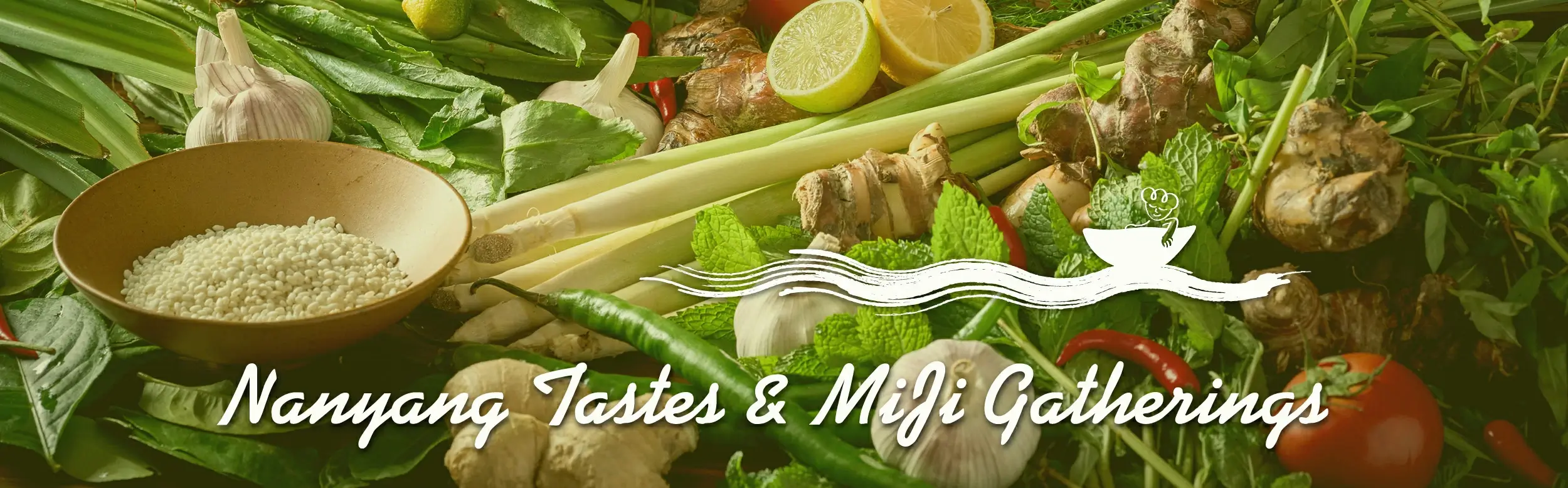
南洋好味 · 小聚米急
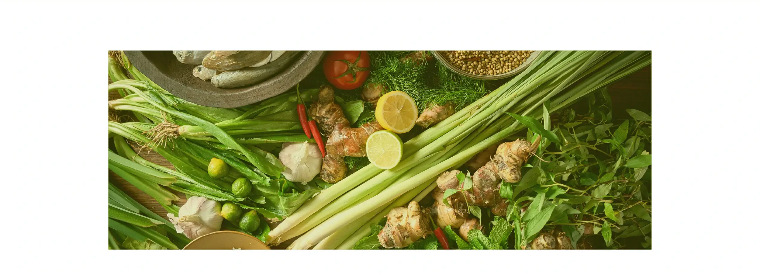
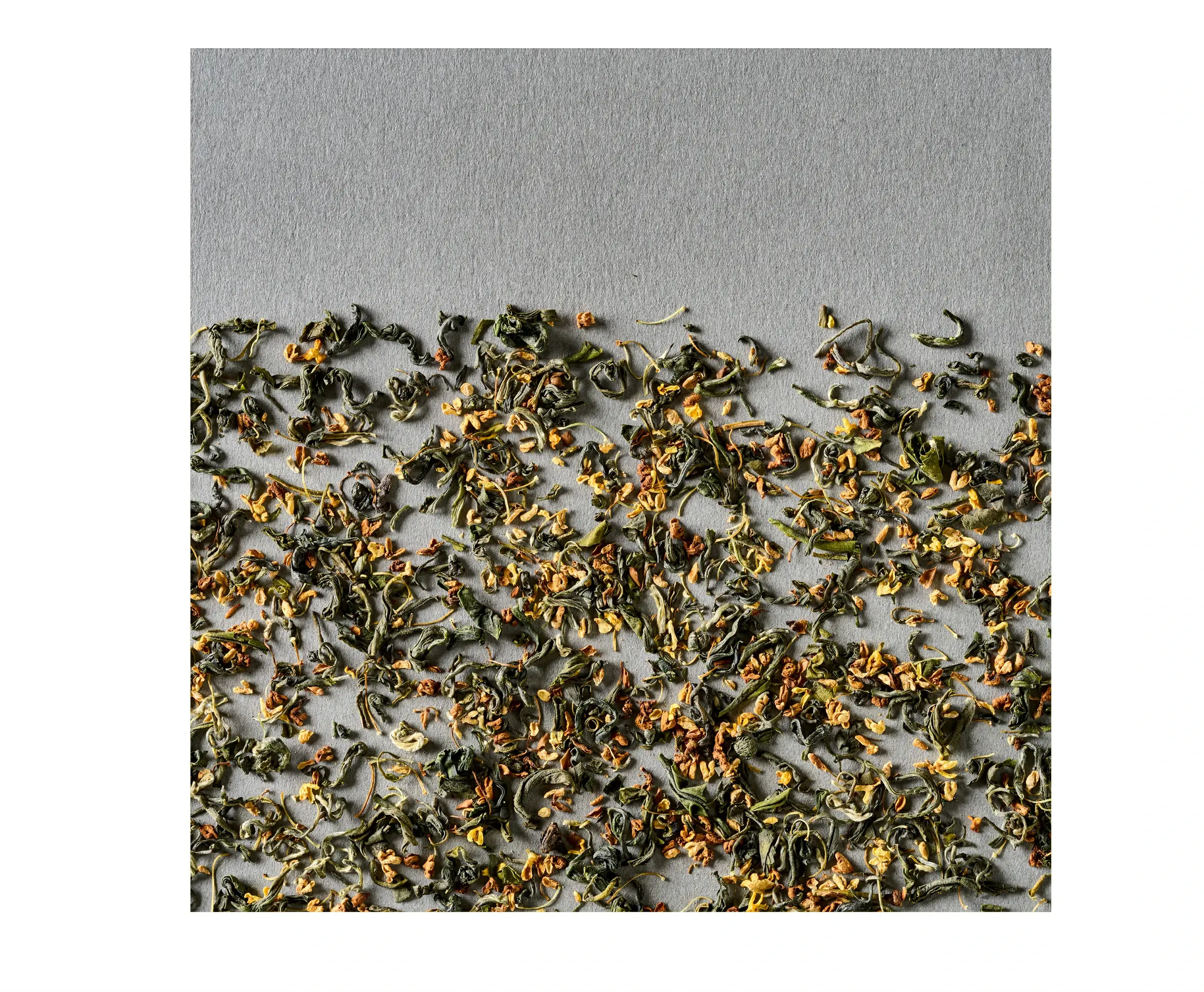
艺彩昭和此次的“米急” 菜牌设计以南洋料理的多元食材与浓郁风情为核心表达。高清呈现香茅、柠檬、各色香料等南洋食材的鲜活质感,搭配富有热带气息的视觉风格,将品牌标识(小船波浪图案)巧妙融入。通过对南洋风味元素的具象化渲染,让食客在翻阅时便能直观感知餐厅对南洋美味的匠心呈现,沉浸式体验 “汇聚南洋滋味,邂逅米急风情” 的饮食氛围。
Syouwa Design's menu for "Miji" embodies the vibrant diversity and rich culinary heritage of the region. High-definition visuals highlight the fresh textures of lemongrass, lime, and aromatic spices, while a tropical-inspired aesthetic seamlessly integrates the brand's signature boat-and-wave motif. Through evocative depictions of Southeast Asian ingredients, the menu invites diners to explore the restaurant's dedicated craftsmanship, immersing them in an experience that "gathers the flavors of Southeast Asia, revealing the unique charm of Miji."
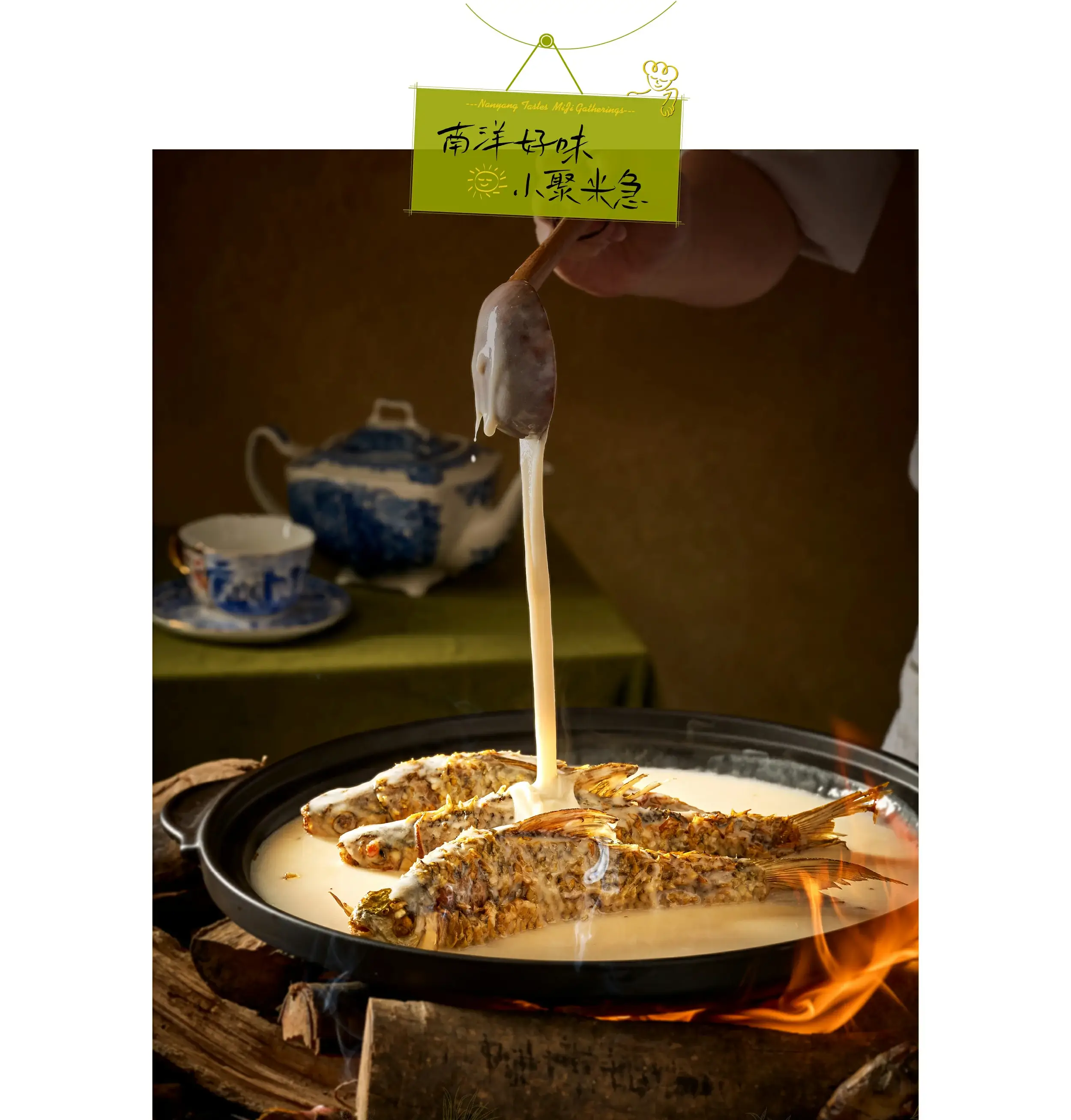
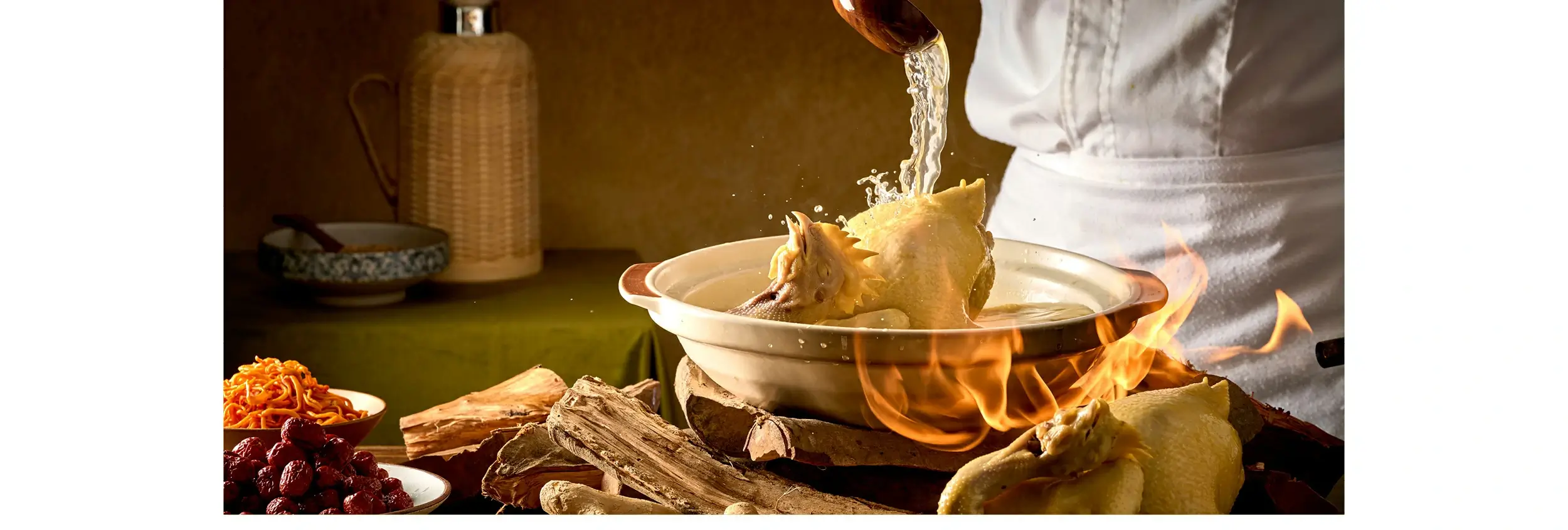
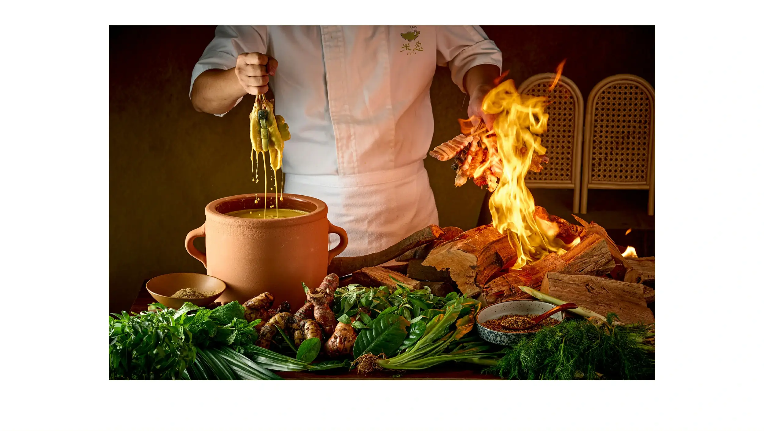
“菜牌设计在场景营造上尤为用心,借由复古南洋茶具、明火烹饪的画面细节,
将南洋料理的烟火气与文化底蕴层层铺展。每帧菜品画面的光影调度与布景巧思,
都在诉说南洋风味的醇厚肌理,让菜牌成为一场味觉与视觉的南洋文化巡礼,
尽显品牌对风味呈现与文化表达的双重雕琢。
将南洋料理的烟火气与文化底蕴层层铺展。每帧菜品画面的光影调度与布景巧思,
都在诉说南洋风味的醇厚肌理,让菜牌成为一场味觉与视觉的南洋文化巡礼,
尽显品牌对风味呈现与文化表达的双重雕琢。
The design pays special attention to atmosphere, using nostalgic tea set imagery and open-flame cooking scenes to unfold the layered cultural richness of the cuisine. Each dish is captured with carefully composed lighting and styling, narrating the depth of Southeast Asian flavors—transforming the menu into a visual and sensory journey that reflects the brand's commitment to both taste and cultural storytelling.
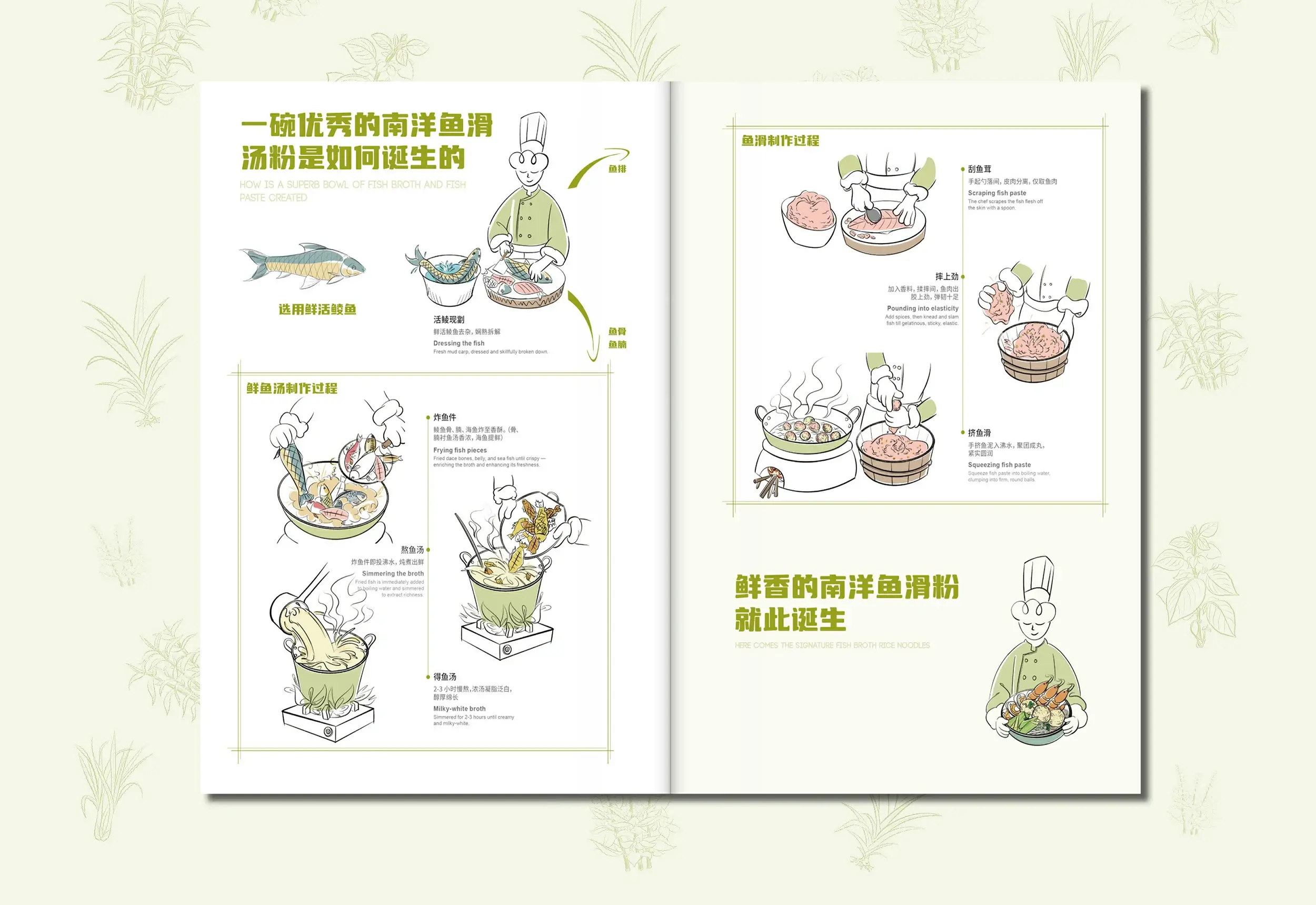
菜牌设计在工艺呈现上别出心裁,以清新手绘插画解构南洋鱼滑汤粉的制作流程。
卡通化的厨师形象、步骤化的工艺分解,搭配柔和的浅绿配色,
将复杂的烹饪技艺转化为直观且富有趣味的视觉叙事。
每一幅插画都在娓娓道来南洋风味的匠心传承,让食客在了解美味诞生的同时,
也能感受到品牌对南洋饮食文化的细致解读与创意表达。
卡通化的厨师形象、步骤化的工艺分解,搭配柔和的浅绿配色,
将复杂的烹饪技艺转化为直观且富有趣味的视觉叙事。
每一幅插画都在娓娓道来南洋风味的匠心传承,让食客在了解美味诞生的同时,
也能感受到品牌对南洋饮食文化的细致解读与创意表达。
A distinctive hand-drawn style illustrates the preparation of Southeast Asian fish ball noodle soup, breaking down the cooking process through a friendly cartoon chef and clear steps. Set against a soft green palette, these illustrations turn complex techniques into an engaging visual narrative—allowing guests to appreciate the culinary tradition while experiencing the brand's creative interpretation of Southeast Asian food culture.
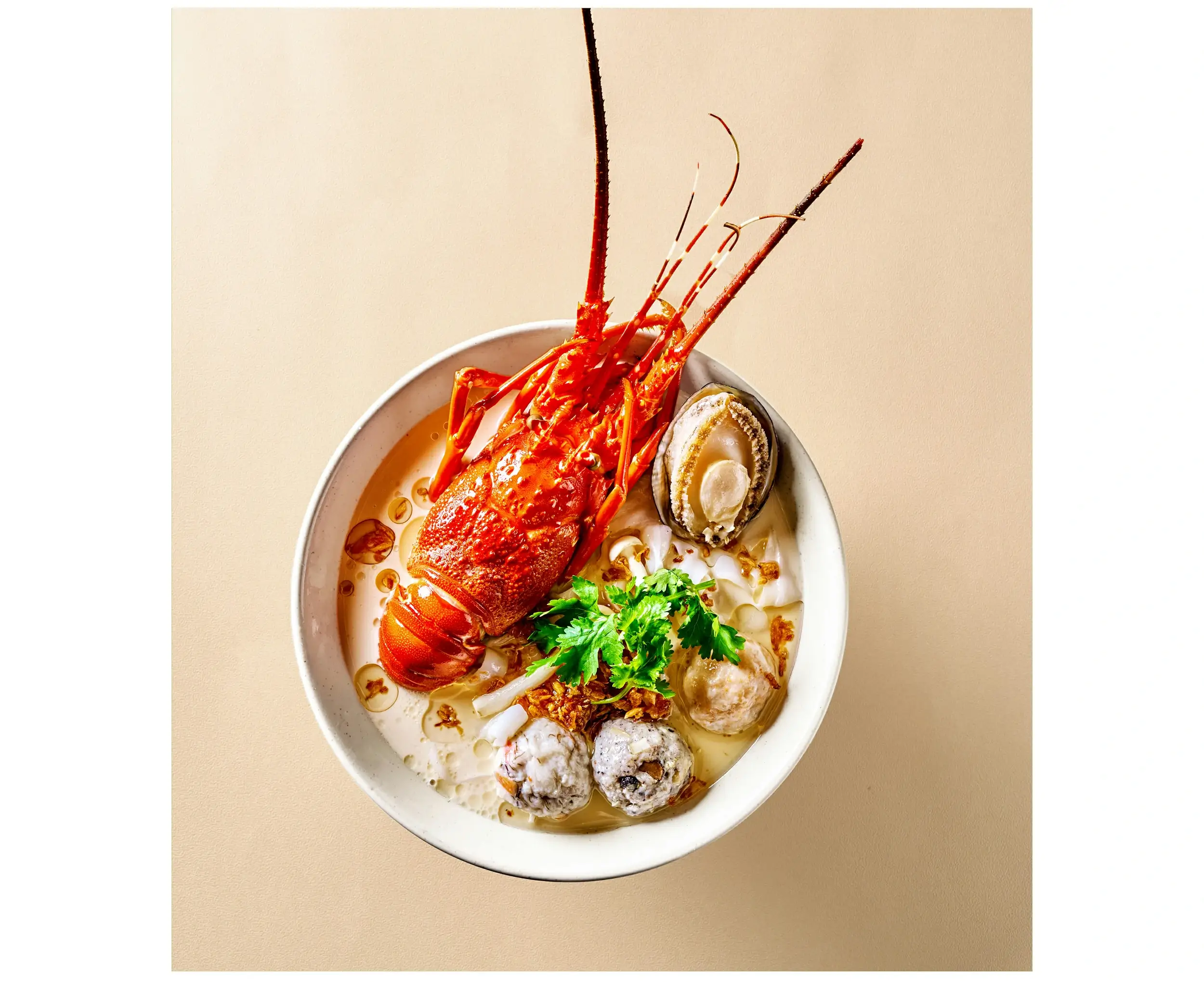
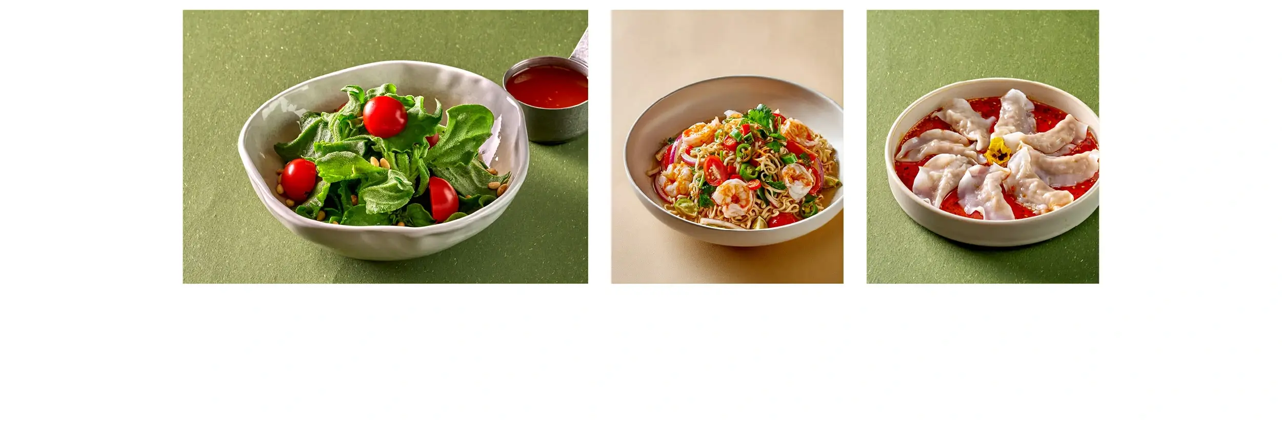
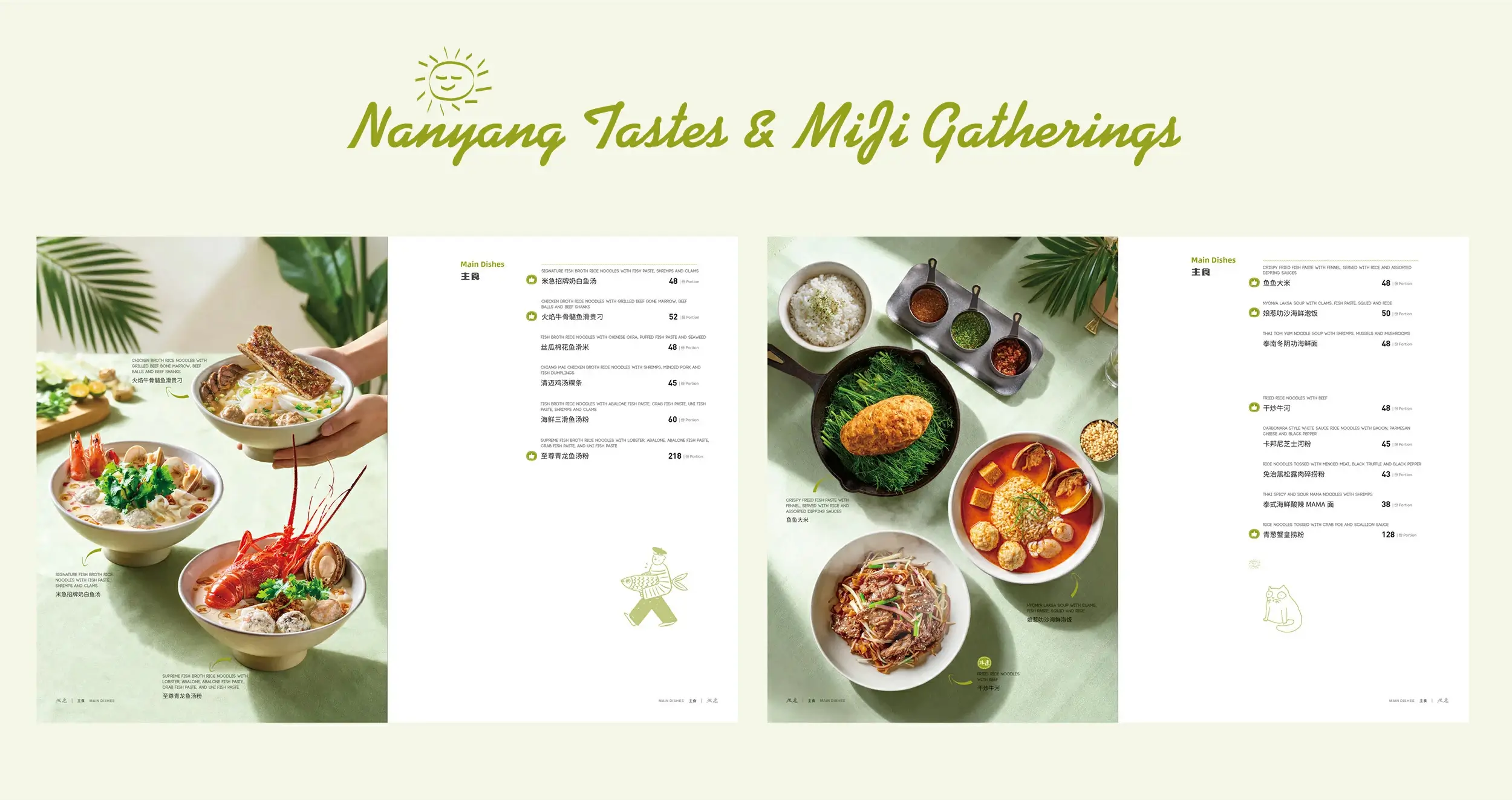
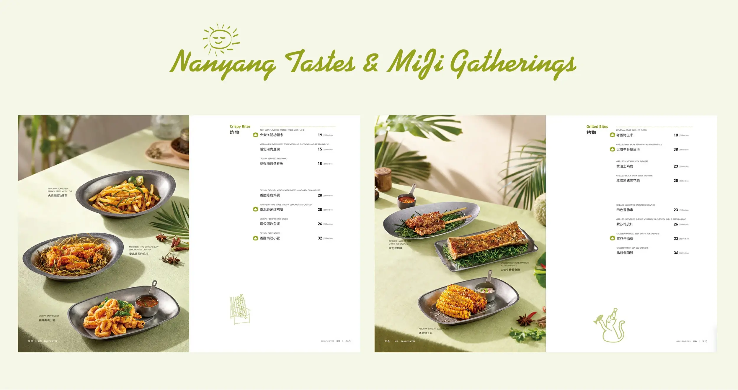
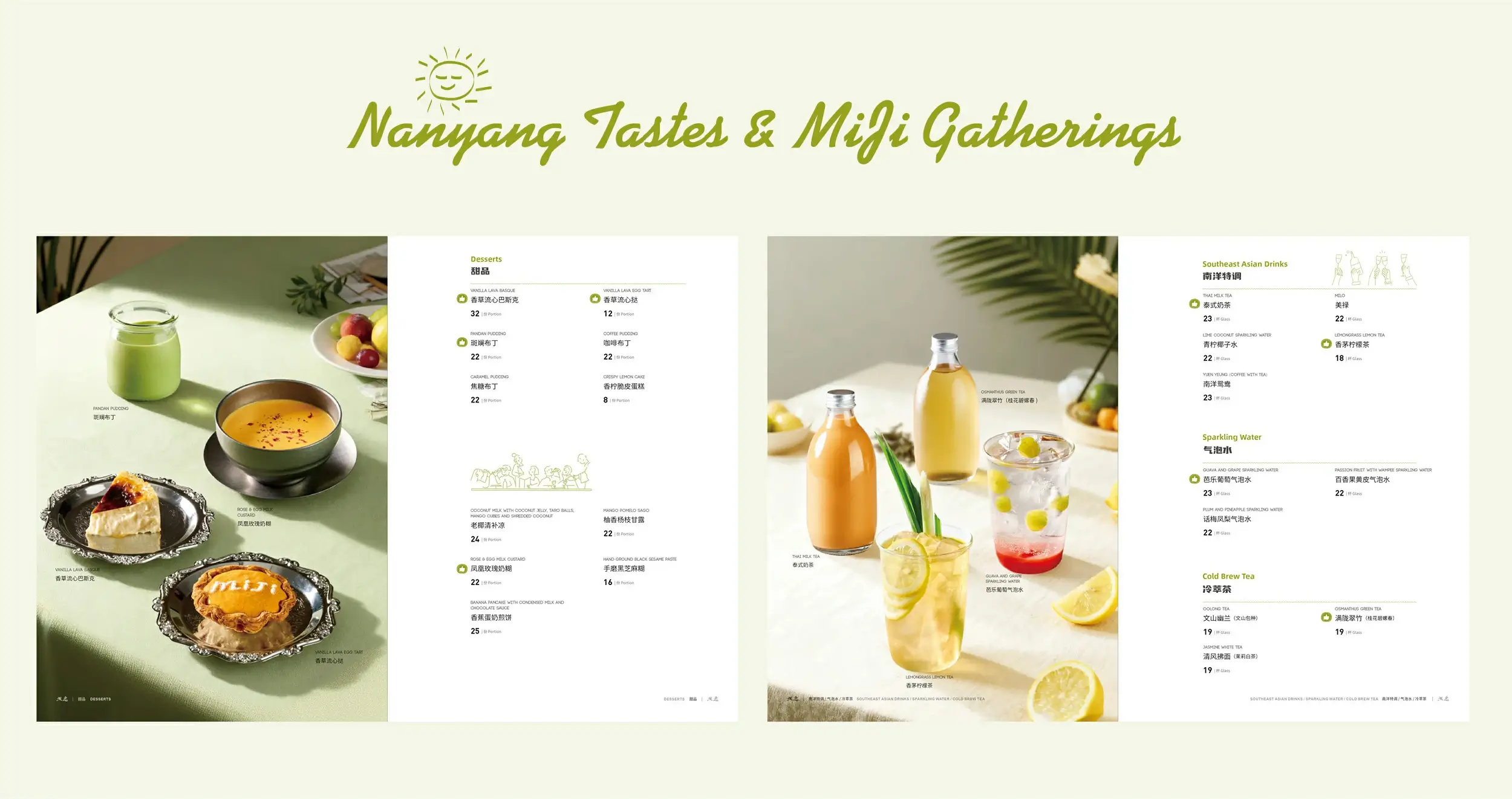
菜牌设计在视觉体系上极具辨识度,以清新浅绿为主色调,呼应南洋食材的天然质感。
菜品排版按“炸物”“烤物”等类别清晰分区,高清餐食图与简洁价目信息错落呈现,搭配棕榈叶、香料等南洋元素与趣味插画,既实现了信息的高效传递,又通过视觉细节勾勒出南洋饮食文化的鲜活场景,让每一页菜牌都成为“南洋风味小聚”的生动注解。
菜品排版按“炸物”“烤物”等类别清晰分区,高清餐食图与简洁价目信息错落呈现,搭配棕榈叶、香料等南洋元素与趣味插画,既实现了信息的高效传递,又通过视觉细节勾勒出南洋饮食文化的鲜活场景,让每一页菜牌都成为“南洋风味小聚”的生动注解。
The visual system is highly recognizable, built around a fresh light green that echoes the natural tones of regional ingredients. Dishes are neatly categorized into sections such as "Fried Specialties" and "Grilled Items," with striking food photography and clean pricing arranged for clarity. Enhanced by palm leaves, spices, and playful graphics, the layout ensures easy navigation while visually evoking the lively setting of a Southeast Asian dining experience—each spread serving as an inviting chapter in a "Southeast Asian Flavor Journey."
艺彩昭和此次为“米急”进行的菜牌设计主要以 “南洋风味小聚” 为核心脉络,从鲜活食材的视觉呈现,
到手绘插画对烹饪工艺的趣味解构,再到浅绿主色调与类别化排版的信息高效传递,每一处细节都相互呼应。无论是餐食画面的质感营造,还是品牌标识、趣味插画的点缀,都在构建完整的南洋饮食文化场景,让菜牌成为美学表达、信息传递与文化诠释的统一载体,尽显品牌对南洋风味与相聚体验的双重匠心。
到手绘插画对烹饪工艺的趣味解构,再到浅绿主色调与类别化排版的信息高效传递,每一处细节都相互呼应。无论是餐食画面的质感营造,还是品牌标识、趣味插画的点缀,都在构建完整的南洋饮食文化场景,让菜牌成为美学表达、信息传递与文化诠释的统一载体,尽显品牌对南洋风味与相聚体验的双重匠心。
Overall, the menu is structured around the concept of a "Southeast Asian Flavor Gathering." From vivid ingredient close-ups and illustrated cooking sequences to the organized layout and cohesive color scheme, each element works in harmony. Through thoughtful photography, branded touches, and expressive visuals, the menu builds a complete cultural and culinary narrative—uniting aesthetic appeal, functional clarity, and cultural depth into one cohesive presentation that celebrates both authentic taste and shared dining moments.